Data Dashboard - Virtual Internship with Practera
2020 Fall Team Project
 IlMinCho
Dashboard Goals
•Present a prototype of a student/team data-dashboard using a mobile first design that will help student teams have a better understanding of how they are tracking in their team-based, industry engaged project.
•It is important for the company to understand how each student/team is progressing through their project, to help identify collaboration issues, to monitor individual student engagement and course completion.
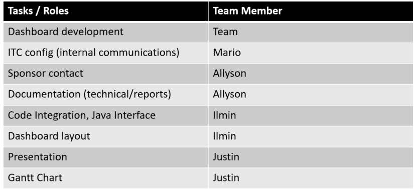
Team Roles
Dashboard
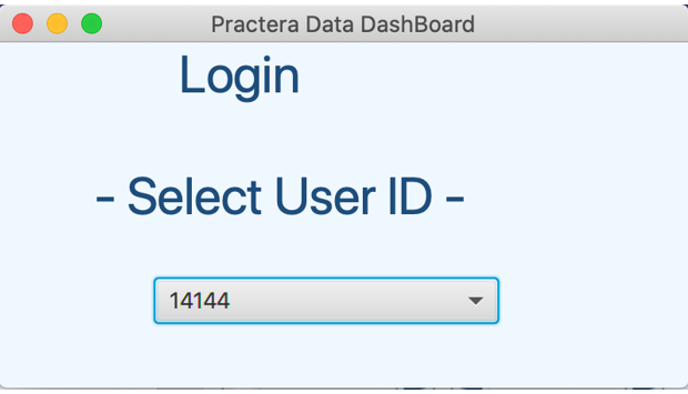
When initially launching the dashboard, a login window is created and a new stage is opened based on the information of the selected user. A border pane based menu and a basic frame are created there where each team member's work is applied to the appropriate selection.
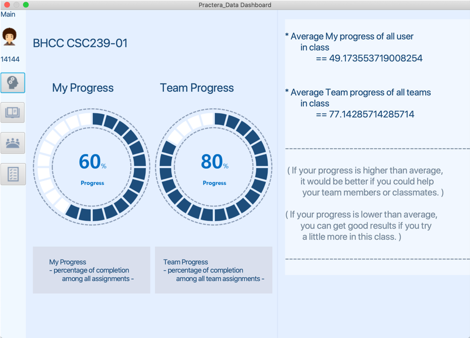
After selecting the user from the login, that individual user’s overall progress is displayed at a glance, and further, by comparing their progress with the average value of the whole class, to get the effect of being able to focus more on the class or help others.
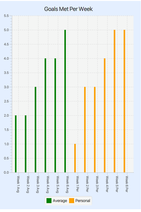
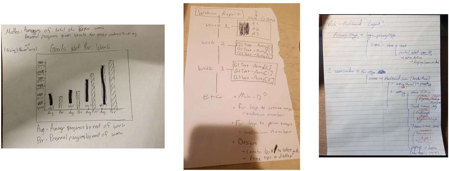
This is a bar chart that depicts the goals completed over the weeks of the project. The y axis represents the goals that can be completed over the given time frame, while the x axis controls the weeks. You will find an average of the total goals completed each week by all participants and a personal score of what the currently selected user has completed in a given week. Its displayed in such a fashion that allows the user to accurately see where they stand at any given point of the project and adjust their workload accordingly.
javafx.scene.chart.BarChart and javafx.scene.chart.XYChart were used in the programming of this display.
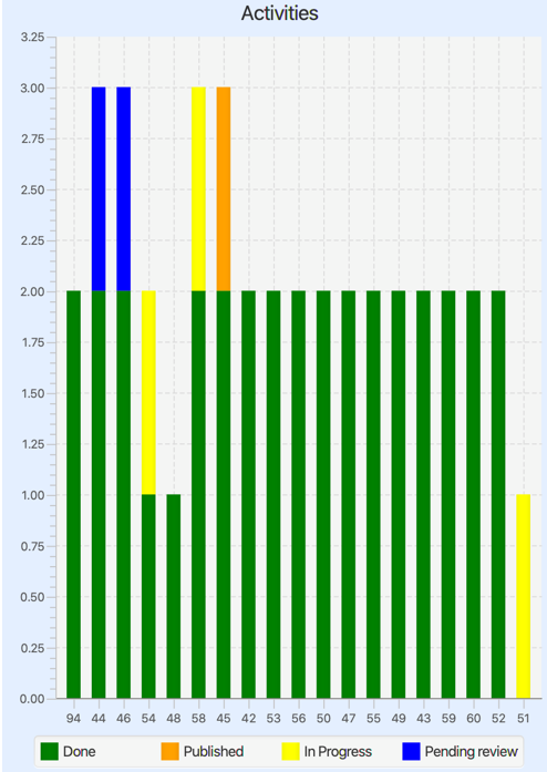
This is a bar chart about activity submissions. It shows the status of each student’s activity. A student could have either: finished the activity (“Done”), published the activity (“published”), posted for review (“pending review”) or it may still be in progress (“in progress”). The y axis represents the number of activities and the x axis represent the last two digits f the user ID since all ID’s start with the numbers “141”.
javafx.scene.chart.StackedBarChart and javafx.scene.chart.XYChart were used to program the graph. Colors are modified using CSS.
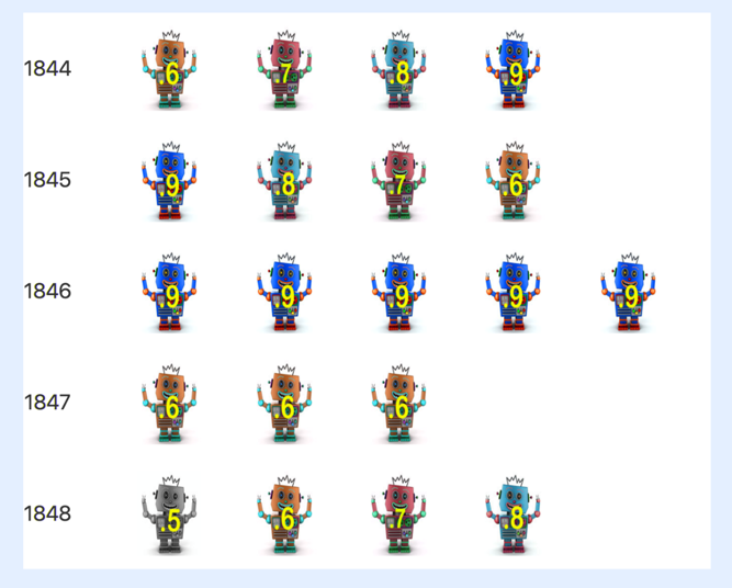
This displays a performance metric of all the students that participated in the project. In the table of images, each row represents a team’s students. For a given student, an image is assigned based on his/her performance for the period of time in the data provided. A number represents the student’s performance from the data set. Because the data provided to us only included the first couple of weeks of the project, the grades presented in this graph should not be taken to represent the final performance of the student throughout this project.
Note that the data this display is using is from the data set but it’s not specific to a student’s overall performance. Instead it’s using the rating given to one of the student’s assessments. This was at first supposed to display information about a student’s badges, hence the badge graphics.
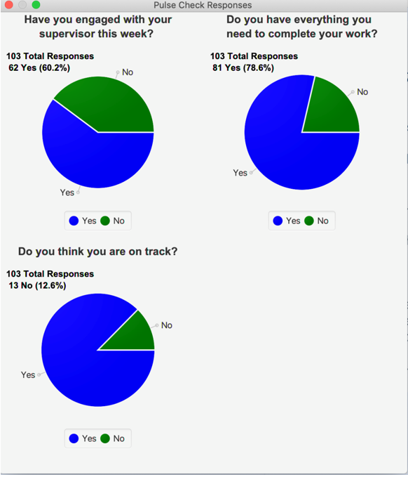
This displays the responses received from the pulse check questions that are periodically given to the students when logged into the Practera website. It shows the number of overall responses from all students received for each question and then shows the yes/no breakdown of the responses with the raw numbers and percentages when hovering the mouse over the pie slices. As more responses are received each week the pies will automatically update to include them. This information can be a useful indicator for a student to see if other student’s are talking to their supervisor, if they have everything they need and whether or not they are on track.
javafx.scene.chart.PieChart was used for the pie displays with a mouse over event to show the yes/no breakdown. A grid pane holds the labels for each question and the pie charts/mouse event captions. Sizes and colors are modified using CSS.
Workflow
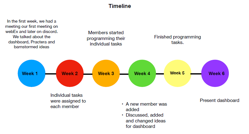
Despite the challenges posed by remote work during the COVID-19 pandemic, our team adeptly leveraged Discord as a virtual collaboration platform. This allowed us to conduct meetings, exchange creative ideas, and advance our project with efficiency and cohesion.
Challenges Experienced & Areas For Improvement
• Risks , Problems and Solutions
- Not having activities done on time.
Not everyone on the team were up to date with the Practera website activities. Also, one
member had technical difficulties with the Practera website.
Solution: Talk with Nikki and remind members of activities. - Problems with individual activities
Some people had to change their task depending on their task and data. Also some
members felt behind or stuck on their task. Also some people did more than others.
Solution: Talk with all members and ask for help
• Dashboard incomplete, theme not consistent, not mobile first
Some areas of the dashboard aren’t complete and aren’t using real data, no central theme or design between areas, not mobile first
• Data set
Was late when received, more complex and messy than we thought it would be, not clear, not a large sample
• Missed or non productive meetings
Some individuals missed meetings, some meetings weren’t productive
• Communications
Microphones and/or cameras not working for meetings•New team member
Came in halthrough the project, had to spend extra time getting them up to speed
• Individual work and initiative
Lack of meeting deadlines for work on assigned tasks, lack of initiative from some individuals
• Collaboration
People mostly worked in silos on their assigned tasks
Key learnings
• Get real world experience.
• Implement JavaFX.
• Work in a team based project.
• Put in practice the knowledge and information given from class.